

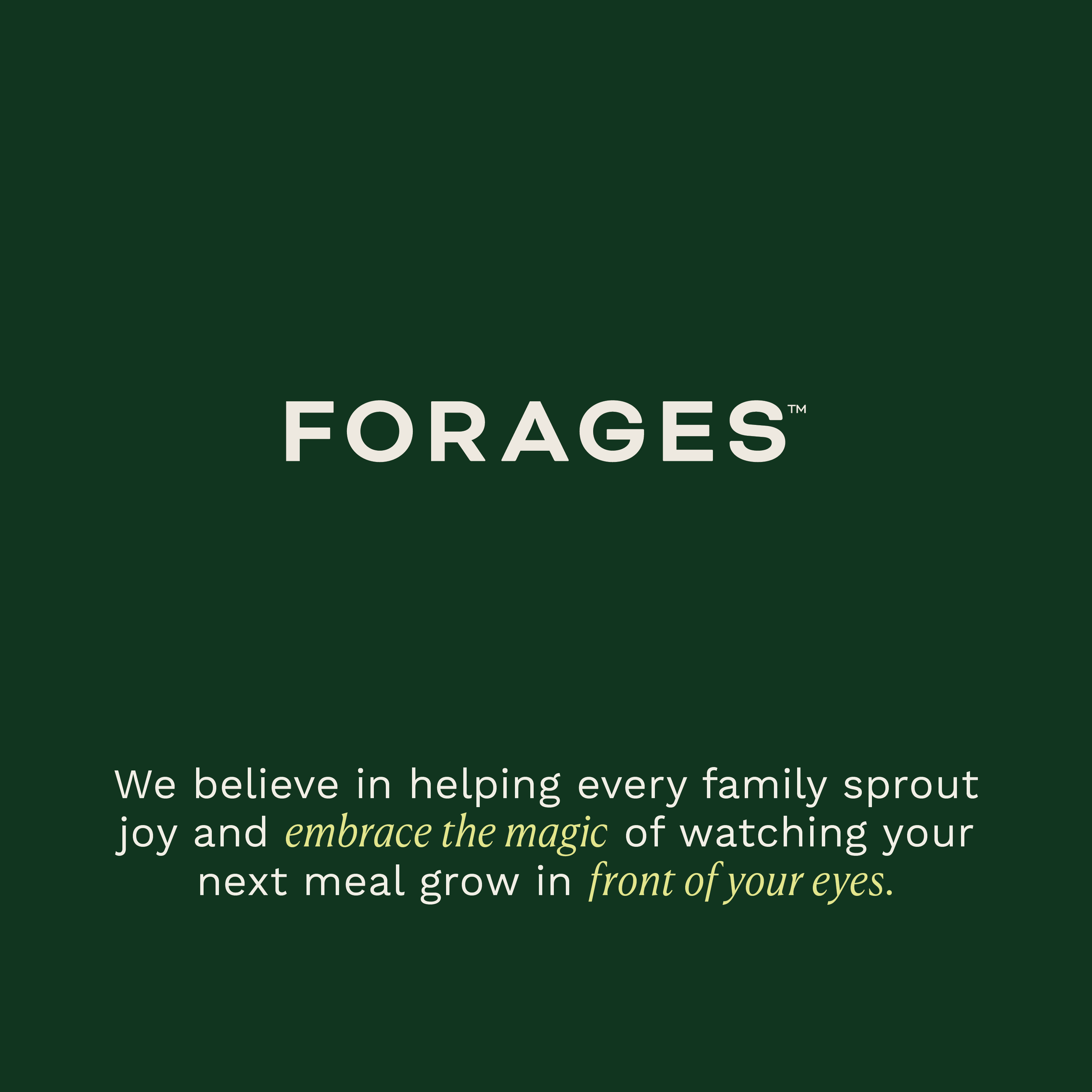
FORAGES
Forages helps wellness-conscious folks take control of their health and food by guiding them on their sprouting journey with a community of resources and tools for every sprouter. Thoughtfully-sourced and designed, Forages sprouting solutions help folks grow healthy, nutritious greens right the first time and every time after.
PACKAGE:
The Full Brand

PROJECT GOALS:
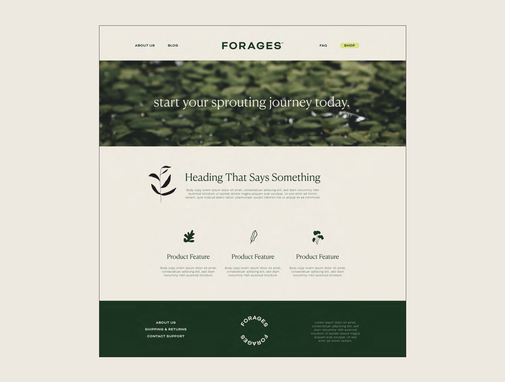
Create a brand that is modern, contemporary and aesthetic forward.
The brand should feel utilitarian and practical while bringing a sense of beauty, honesty and magic.
Give the company a consistent and unique way to launch in the wellness marketplace as a premium product that is future-proof.

THE SOLUTION:

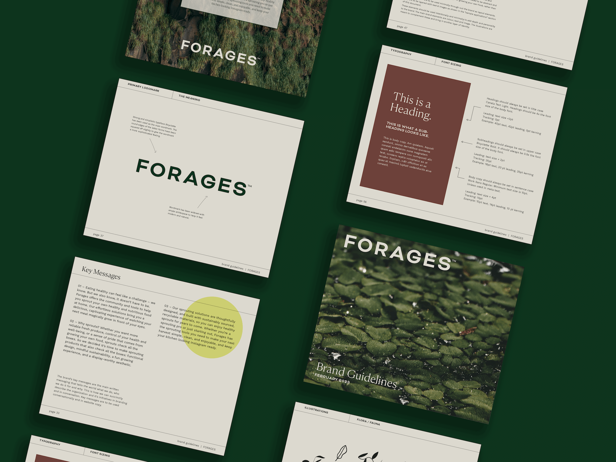
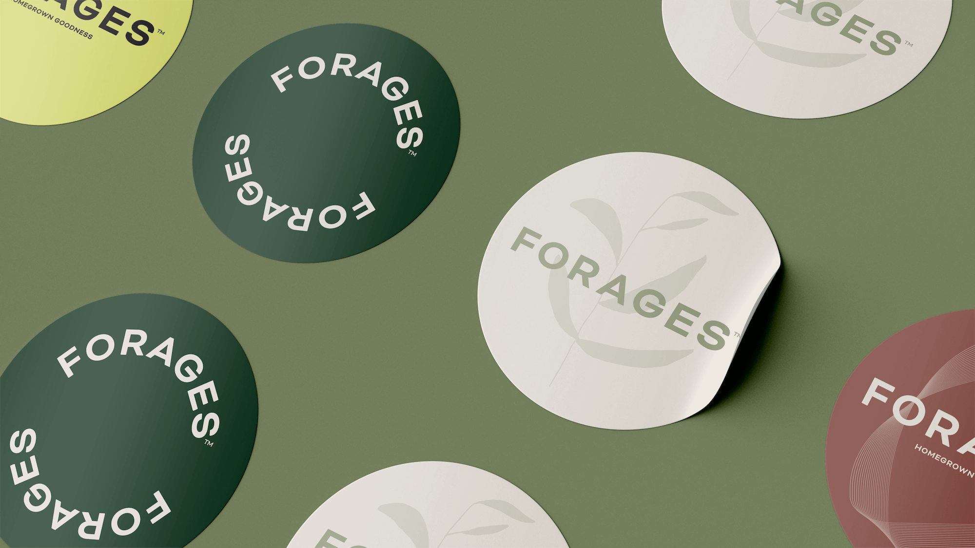
Strong and simplistic typeface for the main wordmark. The round edges of the letter forms have been squared off slightly to give the wordmark a more sophisticated feeling.
Logo is wideset with ample whitespace to help it feel modern and natural.
Various lockups of concentric circles were created to add a futuristic and spiritual vibe to the brand. These illustrations were created to add texture and resemble the spacelike/futuristic/magical process of growing your own food.

Words from the Client:

“The best parts of working with Field & Co. were the great collaboration and the excellent ability to hear our vision and translate it into reality. It is great to have the brand guidelines to stay consistent. It was great working with Kate and the quality of work was excellent.”
– Joseph Hofer, Co-Founder, Forages Co.